Responsive Navbar with React Hooks & Tailwind
How to make a responsive navbar using the Tailwind framework and React Hooks


Hello everyone! Today I am going to be writing my first tutorial on Hashnode! I'll wait while everyone finishes clapping.
All done? Want to clap some more? No? Okay. Let's get started then!
So what inspired me to write this tutorial were my struggles trying to find a good resource for making a responsive navbar with tailwind AND React.. Not something you would think there would be a lack of resources on right?? But alas, I wasn't able to find a solid tutorial for myself. So I thought why not just go ahead and make one of my own! This tutorial is already assuming that you know how to install React and tailwind, so if you don't here is a nifty link to get you started: Link. Once you're all set up with your project, let's get started!
So the first thing we want to do is make a new file in the src folder and name it Navbar.js and then we're going to go ahead and open that file and start editing it! The first thing we're going to do with our navbar component is to create an arrow function and give it a return statement as well as an export statement like this:
const Navbar = () => {
  return (
    <nav></nav>
  )
}

export default Navbar
Next thing we'll want to do is set up our Navbar with some tailwind classes:
const Navbar = () => {
  return (
    <nav className="flex flex-col md:flex-row bg-blue-50 text-blue-600
      text-2xl fixed w-screen">
    </nav>
  )
}

export default Navbar
You might be thinking woah that's a lot of classes all at once. What are they all doing? Let me break it down real fast (it's actually super simple) flex makes the nav element a flexbox, while flex-col sets the flex-flow to column instead of the default rows. This is for small viewports and up, while we use md:flex-row to set the flex-direction to rows on medium viewports and up. This is very important for the responsive part of this. We'll get to that later. Next we use bg-blue-50 to set the background to a light blue that comes out of the box with tailwind and then use text-blue-600 to set the text to a darker blue. Next we use the fixed class to make the navbar stay at the top of the page while scrolling (this is a preference, you don't need this) and set the width to the length of the screen with w-screen. Also we used the items-center class to center the items in the nav. Thus we have a flexbox nav that stretches to the width of any screen and stays at the top while scrolling. Good deal? Good.
So now that we have our nav container, let's start making our nav links and putting them inside of our navbar. The first thing we want to do is use a div to hold our brand link. We'll give that the classes flex and items-center.
const Navbar = () => {
  return (
    <nav className="flex flex-col md:flex-row bg-blue-50 text-blue-600
      text-2xl fixed items-center w-screen">
      <div className="flex items-center">
        <a href="#">Green Mist Web Solutions</a>
      </div>
    </nav>
  )
}

export default Navbar
Next let's start adding in our other links! We'll do that using anchor (a) tags inside of another div. We're going to give it the flex class as well and make it into a nested flex container. That will end up looking like this:
const Navbar = () => {
  return (
    <nav className="flex flex-col md:flex-row bg-blue-50 text-blue-600
      text-2xl fixed items-center w-screen">
      <div className="flex items-center">
        <a href="#">Green Mist Web Solutions</a>
      </div>
      <div className="flex">
        <a href="#">About</a>
        <a href="#">Services</a>
        <a href="#">Contact</a>
      </div>
    </nav>
  )
}

export default Navbar
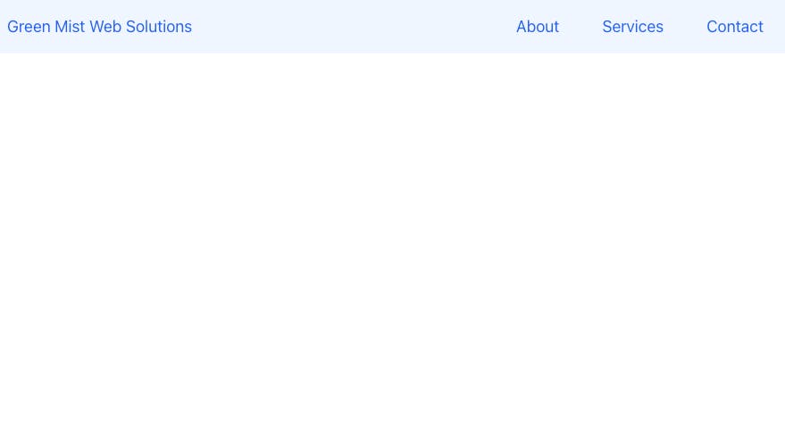
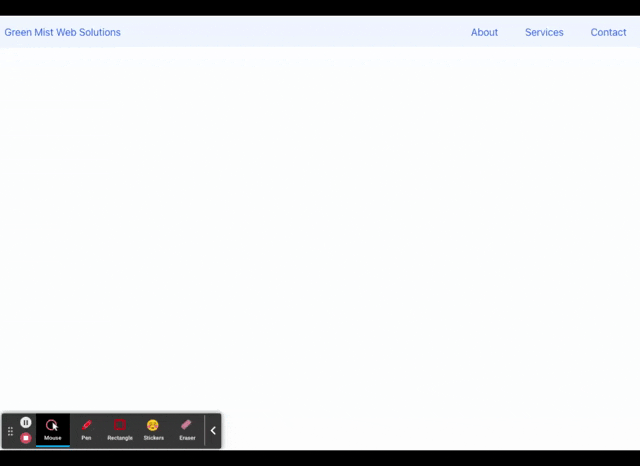
Afterwards, we should have something that looks like this on desktop
Now, that won't do any good having all of those links smashed together next to each other now will it? If we want the navbar to be usable that is. So let's put some margin and padding around the links to make them look nicer! Let's also set the justify-between class so that the links are spread to the opposite ends of the container.
const Navbar = () => {
  return (
    <nav className="flex flex-col md:flex-row bg-blue-50 text-blue-600
      text-2xl justify-between fixed w-screen">
      <div className="flex items-center">
        <a href="#" className="pl-2 py-4">Green Mist Web Solutions</a>
      </div>
      <div className="flex">
        <a href="#" className="px-6">About</a>
        <a href="#" className="px-6">Services</a>
        <a href="#" className="px-6">Contact</a>
      </div>
    </nav>
  )
}

export default Navbar
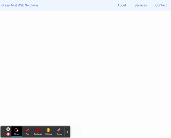
That should leave us with a navbar looking like this now:
So now we have our navbar looking great on medium viewports and up! But what about for small and extra small viewports? How can we get our navbar to become responsive? Well that's where the React Hooks come in. First let's head on over to our App.js file that is already made for us and start editing our file there!
So our App.js file should look something like this after we import our Navbar component and render it:
import './App.css';
import Navbar from './Navbar';

function App() {
  return (
    <Navbar />
  )
}

export default App
So! Before we get started let's go ahead and import the useState hook by adding import { useState } from 'react';Let's get into the useState hook. First thing we'll want to do is set up a hook that will set an isOpen variable to false, and then use a function (setIsOpen) to toggle the state of the isOpen variable to true/false. You can almost think of it like a light switch that turns the lights on/off. We're going to put this inside of our App() function. The way you would use that hook would be like so:
const [isOpen, setIsOpen] = useState(false). Notice how the initial value of the state is false. If you know anything about conditional jsx rendering, you know why this is of great use. Your App.js file should look like this now:
import { useState } from 'react'
import './App.css';
import Navbar from './Navbar';

function App() {
  const [isOpen, setIsOpen] = useState(false);

  return (
    <Navbar />
  )
}

export default App
So now we have our hook written, we'll come back to this in a bit.. for now, let's go back to our Navbar component (Navbar.js) and start adding in some additional elements for small and extra-small viewports.
Before we get started with any of the responsive stuff, one thing I highly recommend doing is adding react-icons to your project. React-icons has become my favorite go to for all of my icons, you can find icons from all different sorts of libraries like font awesome and so much more! To use it in your project just open a terminal in your project folder and type yarn add react-icons --save and then let your pc handle the rest! Once that's finished installing, let's start editing our Navbar.js file.
So every responsive navbar needs to collapse upon scaling down to mobile screens and then make use of a toggle button that opens and closes a drop down menu containing the links for site navigation. So first thing we'll do is import a hamburger icon from react-icons. To do so, we'll add import { FaHamburger } from 'react-icons/fa'. If you want to know how to import other different types of icons head over to react-icons and read their documentation! But for now, we'll stick the font awesome hamburger icon.
So now what we'll want to do is add a div to our file inside of the same div that contains the brand name link and then nest our FaHamburger icon in it like this:
import { FaHamburger } from 'react-icons/fa'

const Navbar = () => {
  return (
    <nav className="flex flex-col md:flex-row bg-blue-50 text-blue-600
      text-2xl justify-between fixed w-screen">
      <div className="flex items-center">
        <a href="#" className="pl-2 py-4 mr-auto md:mr-0">Green Mist Web Solutions</a>
        <div className="md:hidden mr-2 cursor-pointer">
          <FaHamburger />
        </div>
      </div>
      <div className="flex">
        <a href="#" className="px-6">About</a>
        <a href="#" className="px-6">Services</a>
        <a href="#" className="px-6">Contact</a>
      </div>
    </nav>
  )
}

export default Navbar
We also went ahead and gave the div a className of md:hidden so that it's not visible on viewports medium and up, and is instead only visible on small and extra small viewports. We also added the mr-2 class to put some whitespace to the right of the icon, as well as cursor-pointer to turn the cursor into... well, you get it. We also added in mr-auto and md:mr-0 to the brand name a tag so that the icon and the brand name link are on opposite ends of the container on small and extra small, and no margin on medium and up. Next, we'll want the About, Services and Contact links to be hidden on small and below viewports but shown on medium and above viewports. To do this we'll simply add two classes, the hidden class to hide it by default, and then the md:flex class to show it on medium and above. Your code should look like this now:
import { FaHamburger } from 'react-icons/fa'

const Navbar = () => {
  return (
    <nav className="flex flex-col md:flex-row bg-blue-50 text-blue-600
      text-2xl justify-between fixed w-screen">
      <div className="flex items-center">
        <a href="#" className="pl-2 py-4 mr-auto md:mr-0">Green Mist Web Solutions</a>
        <div className="md:hidden mr-2 cursor-pointer">
          <FaHamburger />
        </div>
      </div>
      <div className="hidden md:flex">
        <a href="#" className="px-6">About</a>
        <a href="#" className="px-6">Services</a>
        <a href="#" className="px-6">Contact</a>
      </div>
    </nav>
  )
}

export default Navbar
After this, our navbar should now collapse when we get to small and lower viewports and then expand when we get to medium and up just like this:
So the next thing we'll want to work on is the drop down menu for mobile screens. But before we get into making the actual drop down, let's go back to that useState hook that we had for a minute. Open up your App.js file, and let's make sure that our Navbar.js file has access to the hook. To do this, we'll simply pass the isOpen variable to the <Navbar /> component as props. That would look like this: <Navbar isOpen={isOpen} />. So now our Navbar component has access to the isOpen variable. But we're going to need some sort of function to toggle the state of isOpen upon clicking on the hamburger icon in the mobile nav. To do this we'll write an arrow function and call it toggle. Then we'll nest our setIsOpen function to change the state of the isOpen variable like so:
import { useState } from 'react'
import './App.css';
import Navbar from './Navbar';

function App() {
  const [isOpen, setIsOpen] = useState(false);

  //Add the toggle function here:
  const toggle = () => {
    setIsOpen(!isOpen)
  }

  return (
    <Navbar isOpen={isOpen} />
  )
}

export default App
Basically what this toggle function does is use the setIsOpen function from our hook to set the isOpen variable to true, instead of it's default false. We're about to get into why that's important, but for right now let's also pass this function to our <Navbar /> component as props. Now our App.js file should look like this:
import { useState } from 'react'
import './App.css';
import Navbar from './Navbar';

function App() {
  const [isOpen, setIsOpen] = useState(false);

  //Add the toggle function here:
  const toggle = () => {
    setIsOpen(!isOpen)
  }

  return (
    <Navbar isOpen={isOpen} toggle={toggle} />
  )
}

export default App
We're now done with the App.js file, so we can go ahead and close it out and move on back to our Navbar.js file. First thing we'll want to do is pass in our isOpen and toggle props as arguments into the Navbar function, which we can do with object destructuring const Navbar = ({ isOpen, toggle }) =>. This now gives us the ability to use our useState hook and our toggle function. First thing we'll do is add our toggle function as an onClick event handler to our div containing our icon, which will look like this:
import { FaHamburger } from 'react-icons/fa'

const Navbar = ({ isOpen, toggle }) => {
  return (
    <nav className="flex flex-col md:flex-row bg-blue-50 text-blue-600
      text-2xl justify-between fixed w-screen">
      <div className="flex items-center">
        <a href="#" className="pl-2 py-4 mr-auto md:mr-0">Green Mist Web Solutions</a>
        <div className="md:hidden mr-2 cursor-pointer" onClick={toggle}>
          <FaHamburger />
        </div>
      </div>
      <div className="hidden md:flex">
        <a href="#" className="px-6">About</a>
        <a href="#" className="px-6">Services</a>
        <a href="#" className="px-6">Contact</a>
      </div>
    </nav>
  )
}

export default Navbar
So now when we click on the hamburger icon, it will run our toggle function. When toggle is ran, it sets our isOpen variable to true. Remember when I was talking about JSX conditional rendering? Here is where we can put to the best use. Conditional rendering in React is a way to render one thing (an element, page, etc.) if a condition is true, and another if that condition is false. To do this, we can use a ternary operator. So let's go ahead and set that up below:
import { FaHamburger } from 'react-icons/fa'

const Navbar = ({ isOpen, toggle }) => {
  return (
    <nav className="flex flex-col md:flex-row bg-blue-50 text-blue-600
      text-2xl justify-between fixed w-screen">
      <div className="flex items-center">
        <a href="#" className="pl-2 py-4 mr-auto md:mr-0">Green Mist Web Solutions</a>
        <div className="md:hidden mr-2 cursor-pointer" onClick={toggle}>
          <FaHamburger />
        </div>
      </div>
      <div className="hidden md:flex">
        <a href="#" className="px-6">About</a>
        <a href="#" className="px-6">Services</a>
        <a href="#" className="px-6">Contact</a>
      </div>
      <div className={
       isOpen
            ? 'grid grid-rows-3 text-center w-full items-center bg-blue-50 text-blue-600'
            : 'hidden'
       }
       onClick={toggle}
       >
      </div>
    </nav>
  )
}

export default Navbar
So your probably thinking woah what the hell just happened? So this is the really exciting part where everything comes together. First, we're going to set up a div to house our dropdown menu links. Next, we set up a ternary operator (isOpen ? do this if true : this if false) so we can do some conditional rendering. So we use the state of the isOpen variable to conditionally render two different classes for our div. So when isOpen is set to true we'll render the div. Next, we'll give it the classes grid and grid-rows-3 to turn it into a grid container that has 3 rows. They stack on top of each other like a column, because we have flex-col set as the default flow of the nav flex container. Next we center the text with text-center, give it a width of the entire container width (w-full) and then style the text and background with text-blue-600 and bg-blue-50. Finally we'll center the links with items-center. On the other side of the ternary operator, we have a class set to 'hidden'. This means that when is isOpen is set to false, we will hide the div from view. This works out for us because the hamburger icon is only visible on small and extra small viewports, so the isOpen state can only be toggled when the user is on a mobile device, and not when on a medium and up viewport. So when the hamburger icon is clicked, it will open and close the drop down menu. The last thing we need to do is add some links to our dropdown menu and we'll be finished! Let's go ahead and do that now:
import { FaHamburger } from 'react-icons/fa'

const Navbar = ({ isOpen, toggle }) => {
  return (
    <nav className="flex flex-col md:flex-row bg-blue-50 text-blue-600
       text-2xl justify-between fixed w-screen">
      <div className="flex items-center">
        <a href="#" className="pl-2 py-4 mr-auto md:mr-0">Green Mist Web Solutions</a>
        <div className="md:hidden mr-2 cursor-pointer" onClick={toggle}>
          <FaHamburger />
        </div>
      </div>
      <div className="hidden md:flex">
        <a href="#" className="px-6">About</a>
        <a href="#" className="px-6">Services</a>
        <a href="#" className="px-6">Contact</a>
      </div>
      <div className={
       isOpen
            ? 'grid grid-rows-3 text-center w-full items-center bg-blue-50 text-blue-600'
            : 'hidden'
       }
       onClick={toggle}
       >
        //add links here
        <a href="#">About</a>
        <a href="#" className="py-2">Services</a>
        <a href="#">Contact</a>
      </div>
    </nav>
  )
}

export default Navbar
And there you have it! We added a py-2 to the middle link so they're not so squished together. But now go ahead and from your project folder, type yarn start into your terminal and press enter. You've done it!!!! Your navbar should now be responsive and look like this:
If you liked this tutorial pls feel free to share it (if you really like listening to me talk, you should give me a follow on Twitter too ;) @dwayne_devs ! Also, if there's anything that can be improved upon please let me know in the comments! I am always open to suggestions. That's all for me now, see you on my next tutorial!